
Built New Construction Homes
MOBILE APP DESIGN
CAREERFOUNDRY COURSE PROJECT 2021-2022
BACKGROUND
Built is a real estate marketplace specializing in new construction homes across California, and provides a way to directly message agents, simplifying the home search process by making information 100% accessible online.
CHALLENGE
In California obtaining information online about newly constructed properties can be an arduous process. Newly constructed homes are not required to be listed publicly, making it difficult for buyers to find information. Finding a real estate agent to answer questions can be equally as overwhelming.
GOAL
Research and design a mobile app that helps buyers find newly constructed homes across California and the ability to directly contact agents with their inquiries
PROBLEM STATEMENT
Buyers of newly developed homes need an efficient way to contact agents and obtain information about available homes in California because such information is not widely available through existing services like Zillow and often involve multiple agents.
We will know this to be true when we see 75% of new home buyers receive up-to-date information on the properties interested, allowing them to make educated decisions.
PROJECT OVERVIEW
My Role: UX Designer
Duration: 5 Months
Tools: Figma, Miro, Lucid Chart, Optimal Workshop, Usability Hub
MY PROCESS
Emphasize
Conceptualize
Design
1. EMPHASIZE
USER INTERVIEWS
In the first phase of the project we lacked an understanding of the newly constructed home market. We did not know what home buyers wanted, needed and expected from our app. As well as the role of the realtor in the buying process.
The 3 Key Questions
What are user’s experience with current real estate apps?
What are users’ pain points with the existing newly constructed home market?
What do users need?
What was the realtor’s role in the process of purchasing a newly constructed home?
I conducted 5 one-on-one semi-structured interviews with 3 home buyers and 2 real estate agents.
2. CONCEPTUALIZE
I synthesized data to form product strategy
The key things I did:
I created affinity maps to better understand our target users
Prioritize user pain points, wants and needs. This helped me prioritize the roadmap & features we wanted to include in the product
Crafted personas
Developed user journeys, user flows & site map
AFFINITY MAP
I first created affinity maps to make sense of the data.
KEY FINDINGS
Builders use their own agents instead of a realtor elected by the home buyer
Info about newly constructed homes is seldomly found on current real estate apps
Users learn about properties on billboards along freeways
Users must physically visit a sales office for details
Users are unsure of who to contact for more info
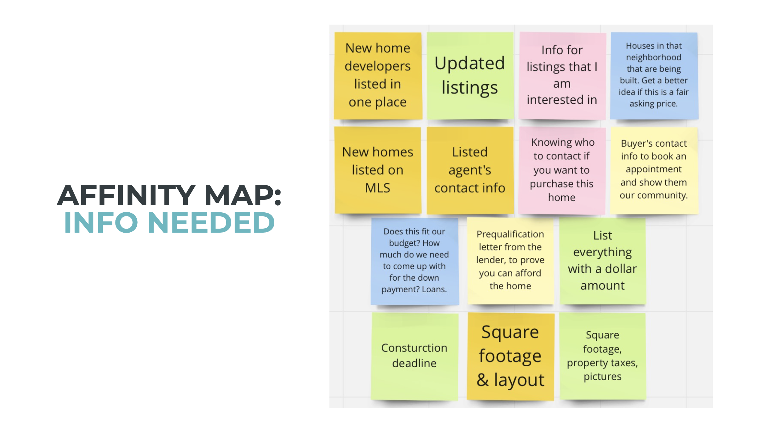
Data analysis by affinity mapping
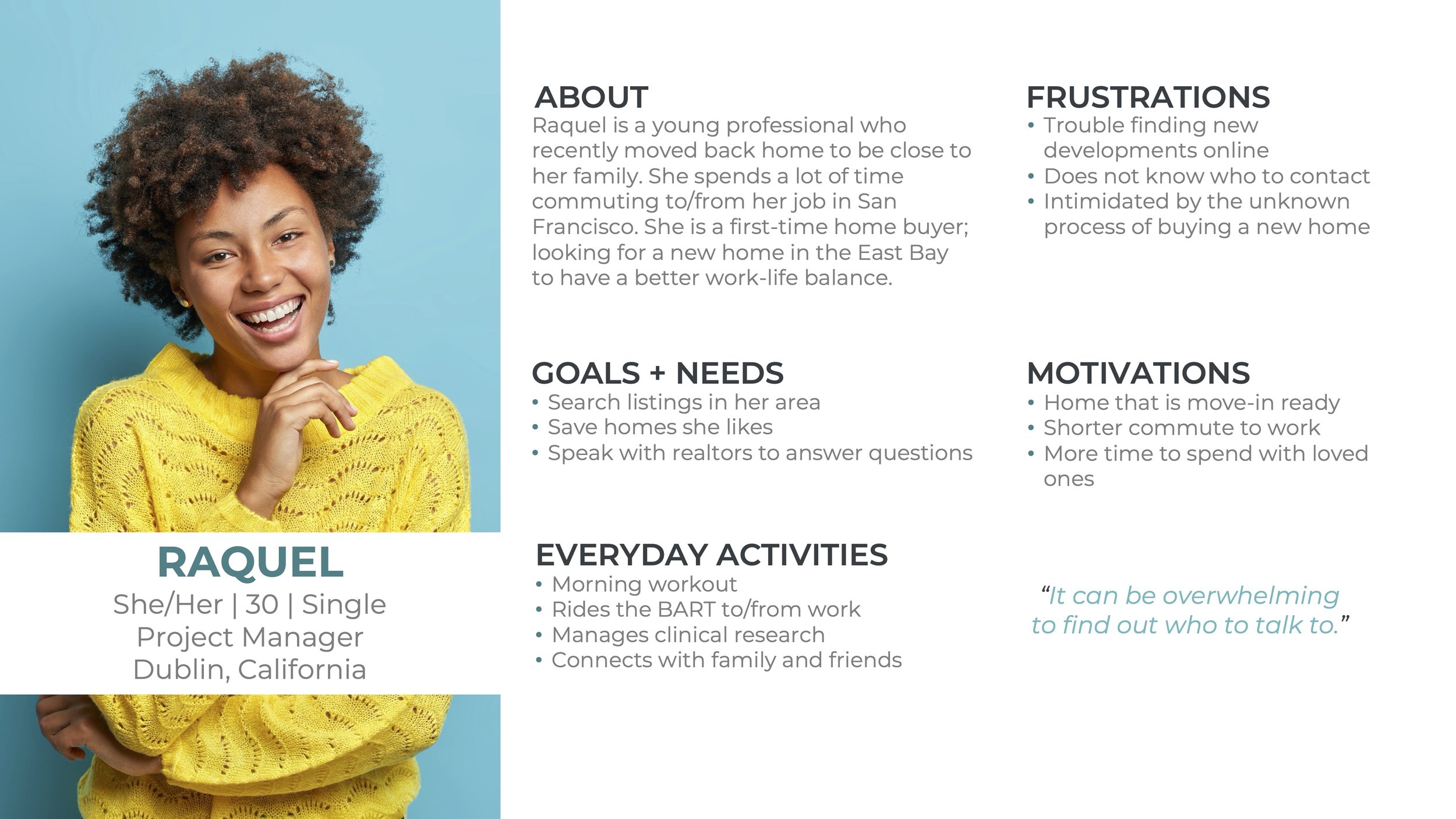
USER PERSONAS
From user interviews, I prioritized home buyers as target users, and developed primary personas, Raquel & Ezekiel. The goals of our primary personas informed the design decisions each step of the way.

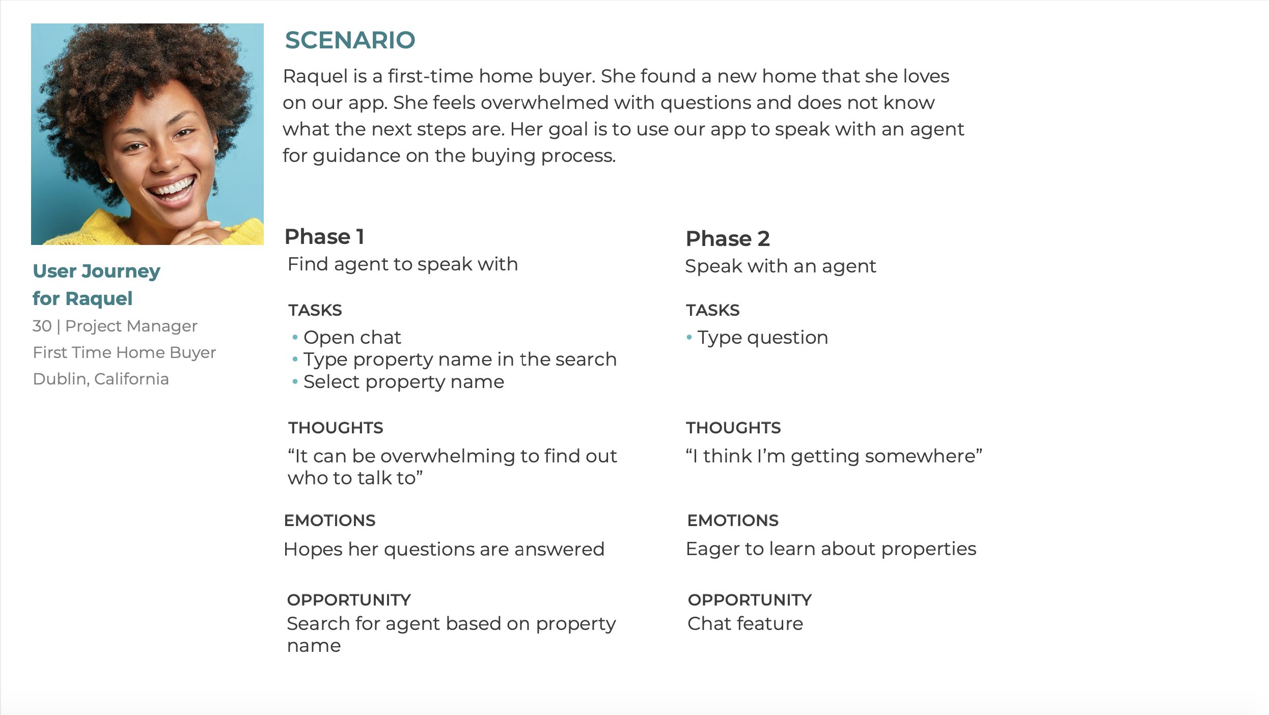
USER JOURNEY
Once our personas were established, I developed user journeys outlining a scenario and tasks to complete the personas’ goals.
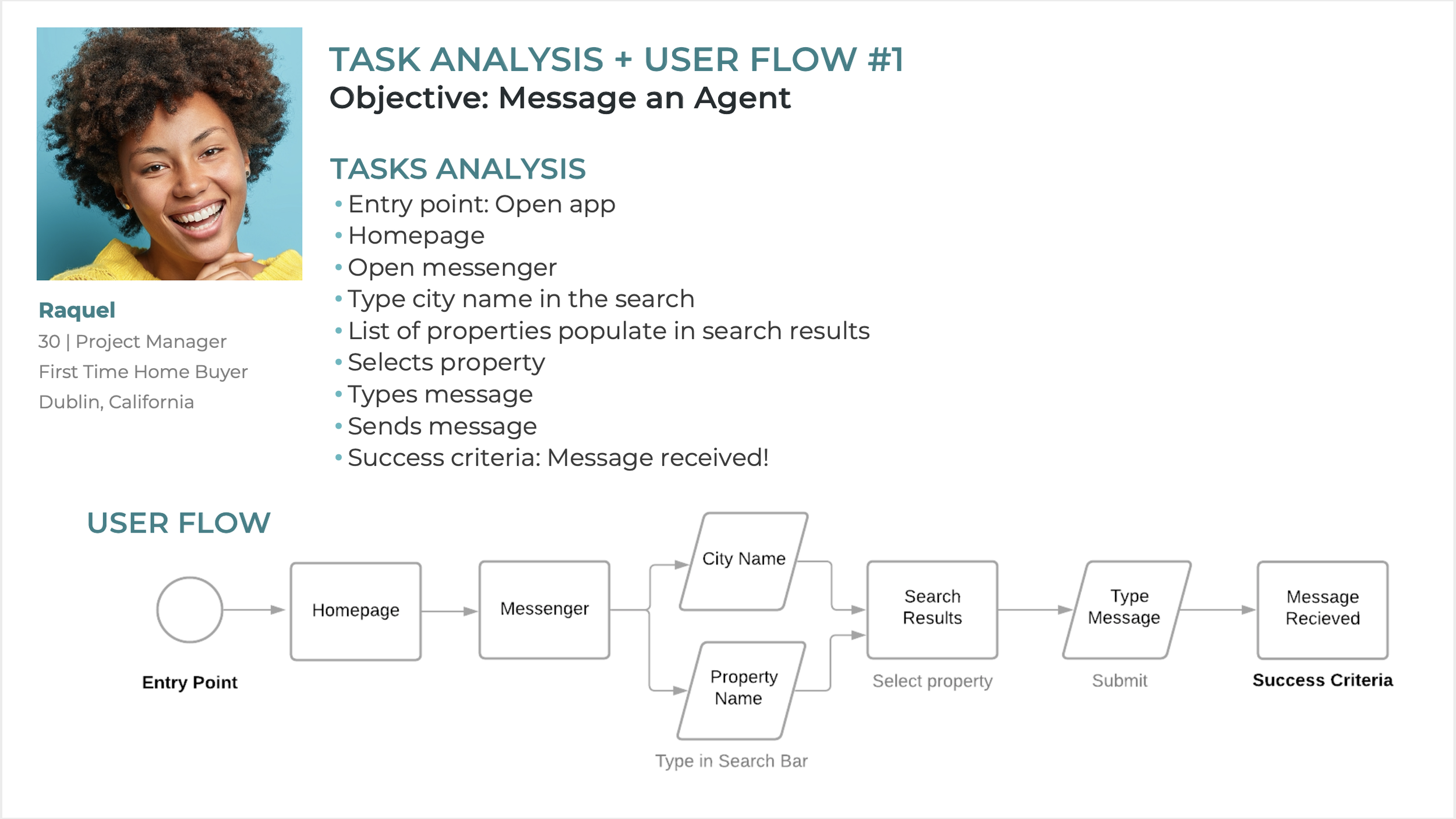
USER FLOW
User flows were designed to show the steps our personas takes to complete a task. Below you will see the steps Raquel makes to message an agent.
INFORMATION ARCHITECTURE
After the user flows were created, I took it a step forward by developing an initial site map. The site map displays the main features that allow Raquel and Ezekiel to navigate through the app and complete tasks.
Our initial site map shows how users can look for home listings, favorites lists, access messenger and profile features.

CARD SORTING TO VALIDATE THE SITE MAP
My next step was verifying that the site map aligned with user’s mental models regarding categorizing map topics. I conducted remote unmoderated card sorting with 8 participants using OptimalSort.
4 main categories emerged as trends in the card sorting exercise: Properties, Account, Favorites and Agents. Other cards were placed under these main categories. Together, the categories and subcategories were implemented into the revised sitemap.
KEY FINDINGS
Looking at the revised site map against the initial site map gives us an idea of user’s mental models. Although both site maps have similar paths, we learned that users believe they can access the messenger/chat through the agent profile.

3. DESIGN
WIREFRAMGING + PROTOTYPING
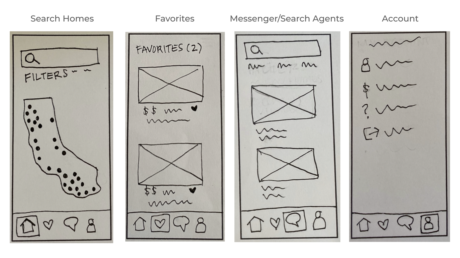
LOW FIDELITY WIREFRAMES
The revised site map was the framework for the low fidelity wireframes. I sketched out low fidelity wireframes for the primary features of the app: Search for homes, favorites, messenger/search for agents and account screens. They highlight the high level functionality of the design and focus on navigation and the structure of each screen.
MID FIDELITY WIREFRAMES
Keeping Raquel and Ezekiel’s goals in mind, I iterated on the wireframes, elaborating on the designs, which evolved into mid fidelity wireframes. Mid fidelity wireframes were digitally designed in Figma containing some visual elements as in buttons and icons, and copy. For time sake, it was designed in gray and white.
These wireframes were linked together to form an interactive prototype. The prototype allows new users to go through the onboarding process, searching for homes and agents, accessing favorites list and message agents.
Now that core features are prototyped, it can be validated through user testing!

USER TESTING
The mid-fidelity interactive prototype was designed to solve Raquel and Ezekiels’ problems. The goal was to test the most important features and functionality: Searching for a home and messaging an agent. The objective was to measure the usability of the messaging feature and determine how the search function flow aligns with users’ expectations.
Moderated-remote usability testing was conducted with six participants.
Target participants are buyers of newly construction homes or new users who have used real estate apps to search for homes. Each participant was asked to complete 3 tasks:
You are looking for a new home with several rooms – one to use as your bedroom, a guest room and an office. Verify the home details to make sure it can be built to suit your needs.
You have just found your dream home on the app. You are expecting to relocate for your job in a year and want to make sure the home will be ready on time. Find the point of contact to discuss the development timeline.
You are interested in learning more about a property but you are quite busy to take a call. Take a few seconds to reach out to the seller to get more information.
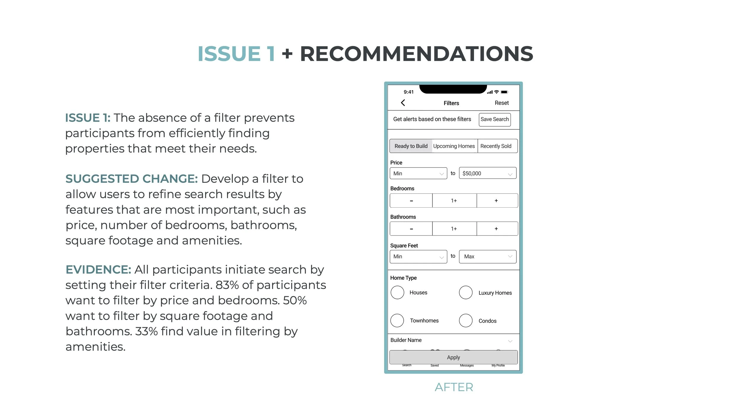
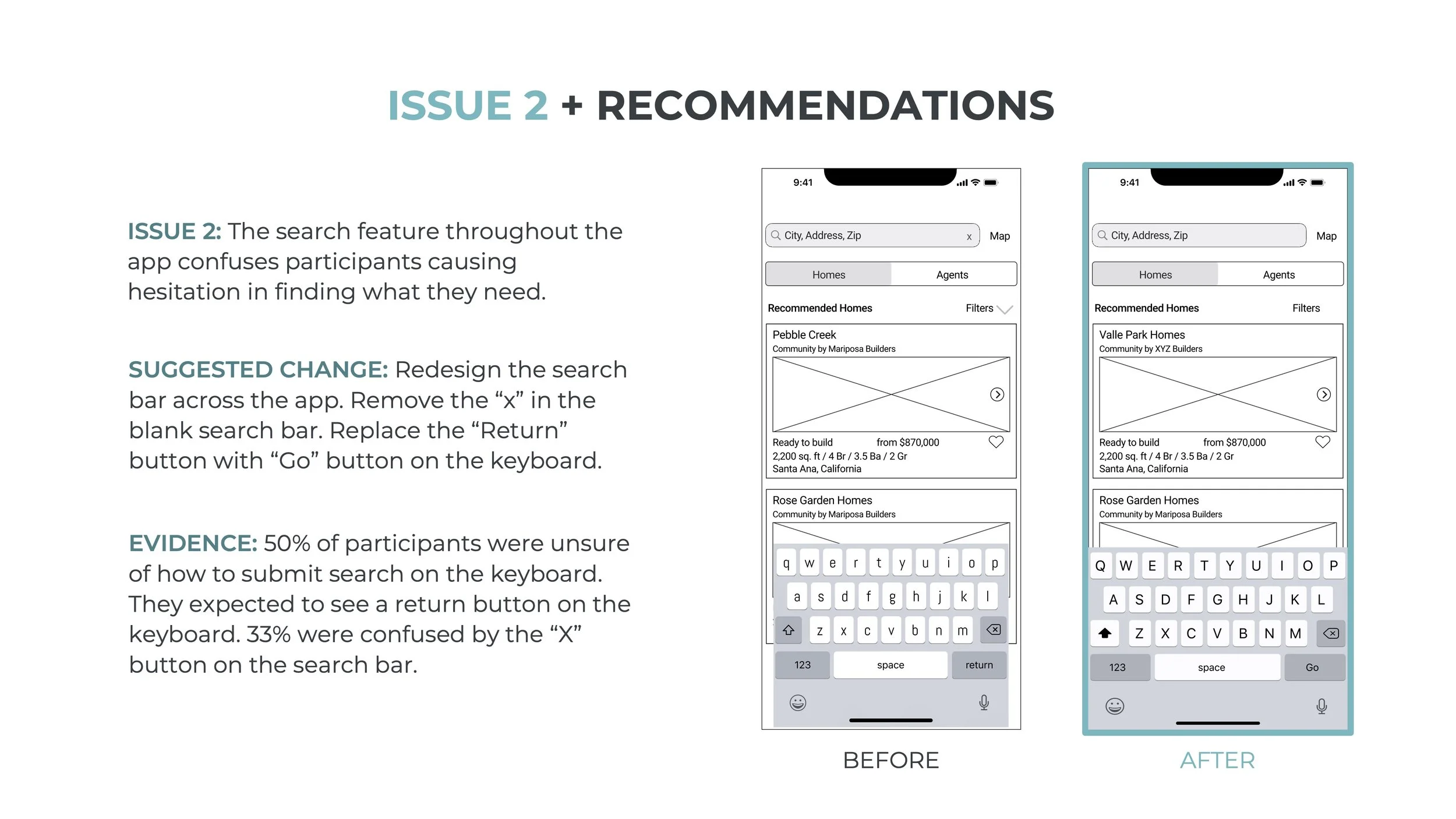
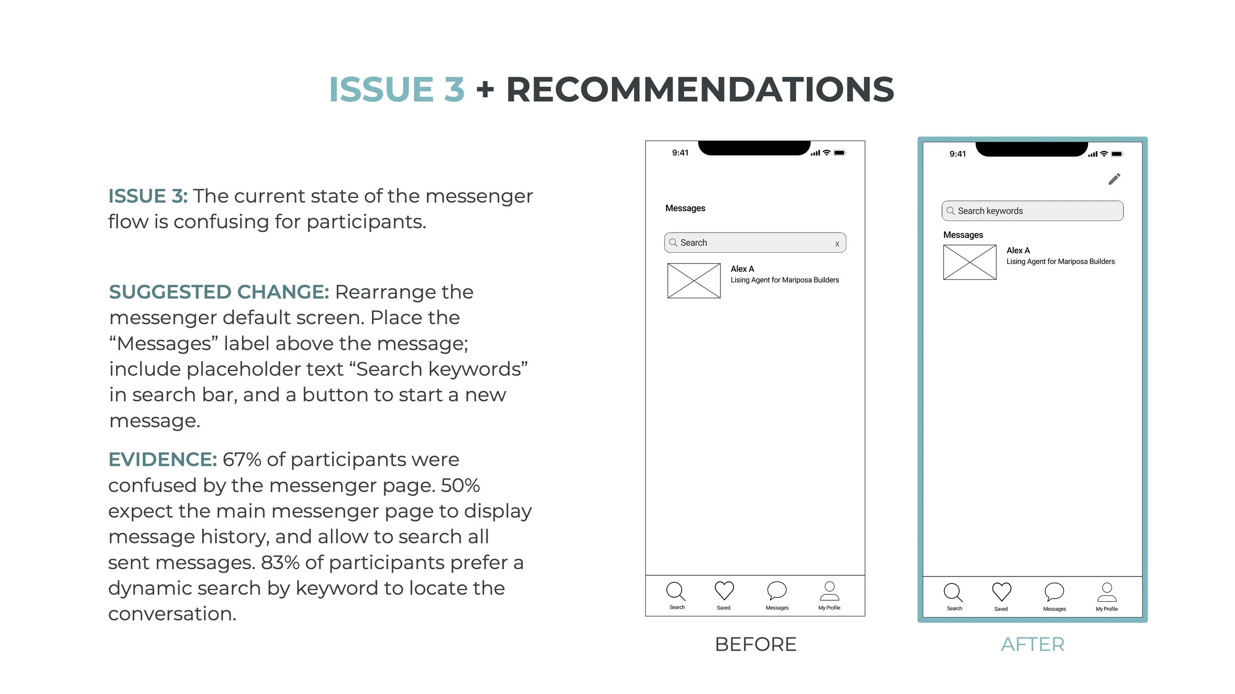
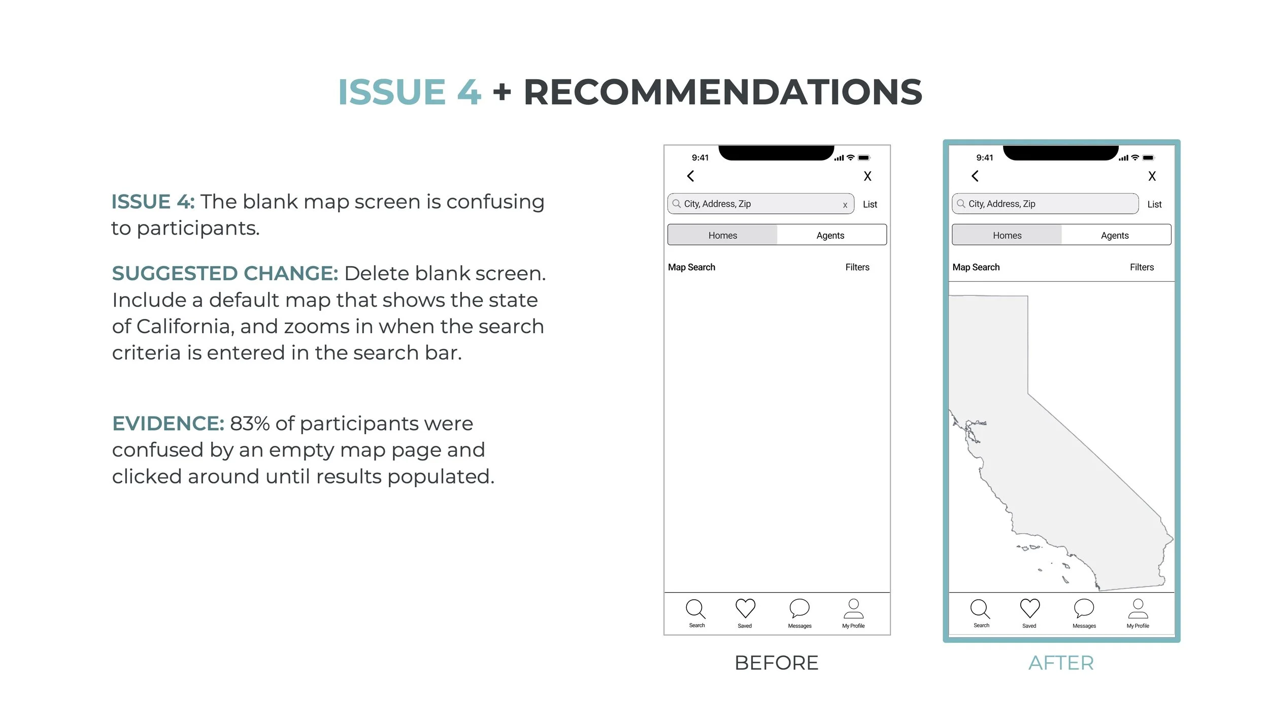
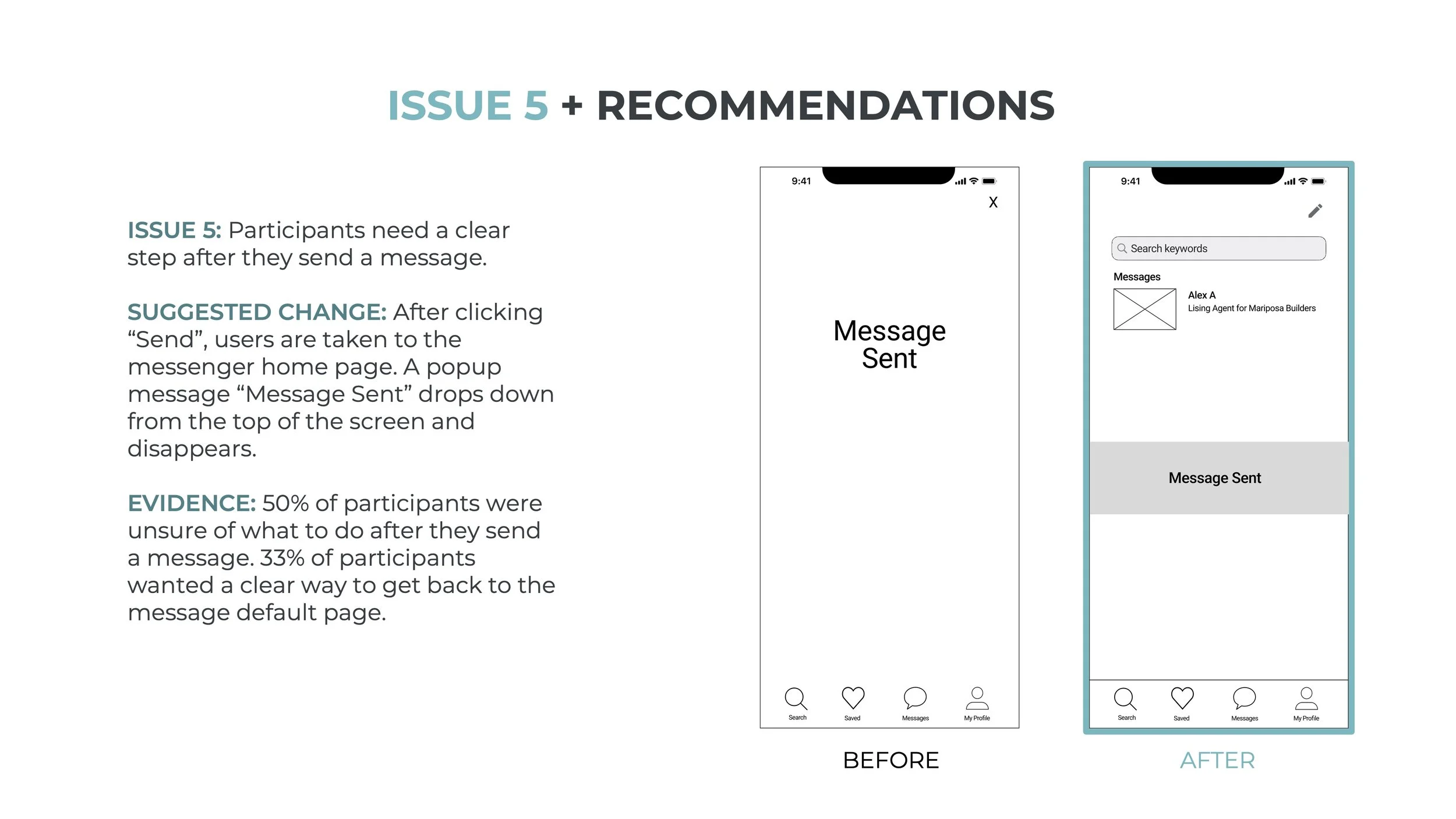
KEY FINDINGS
STYLE GUIDE
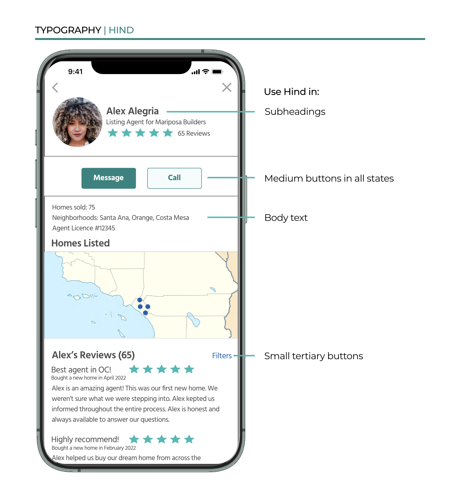
Before iterating on high fidelity wireframes, I created a style guide to establish brand standards throughout the app. Accessibility was at the forefront of my design decisions. I used a color checker to verify the contrast between font colors or button colors and the background color met accessibility standards. I referenced iOS design standards for accessibility details including typography scale.
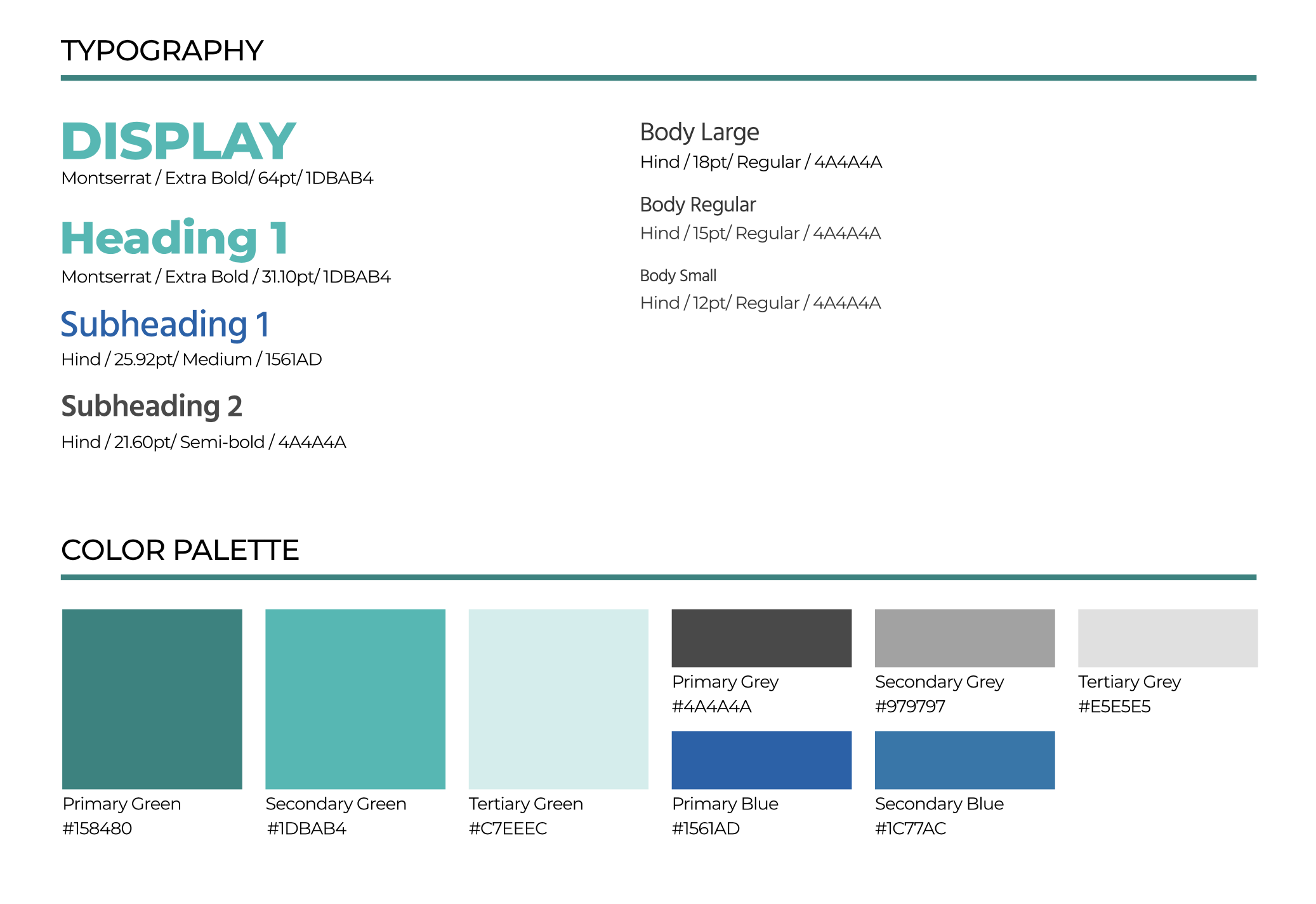
DESIGN LANGUAGE
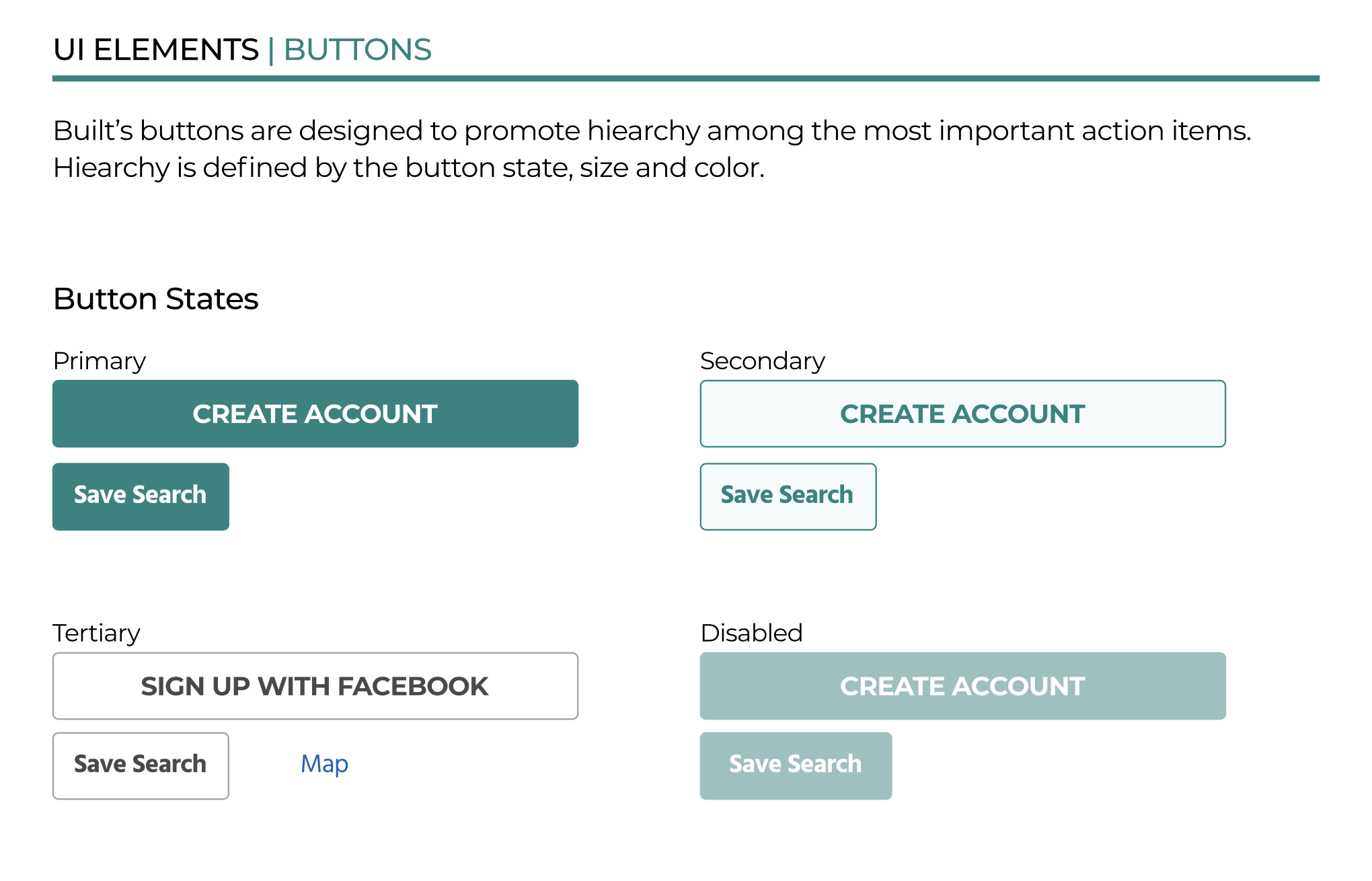
The design language is a roadmap for designers and engineers. It outlines how to implement design elements from typography, color palettes, logos, UI elements, images and illustrations, icons, and tone of voice. iOS standards were followed for details in sizes of buttons, icons and other elements.
HIGH FIDELITY WIREFRAMES
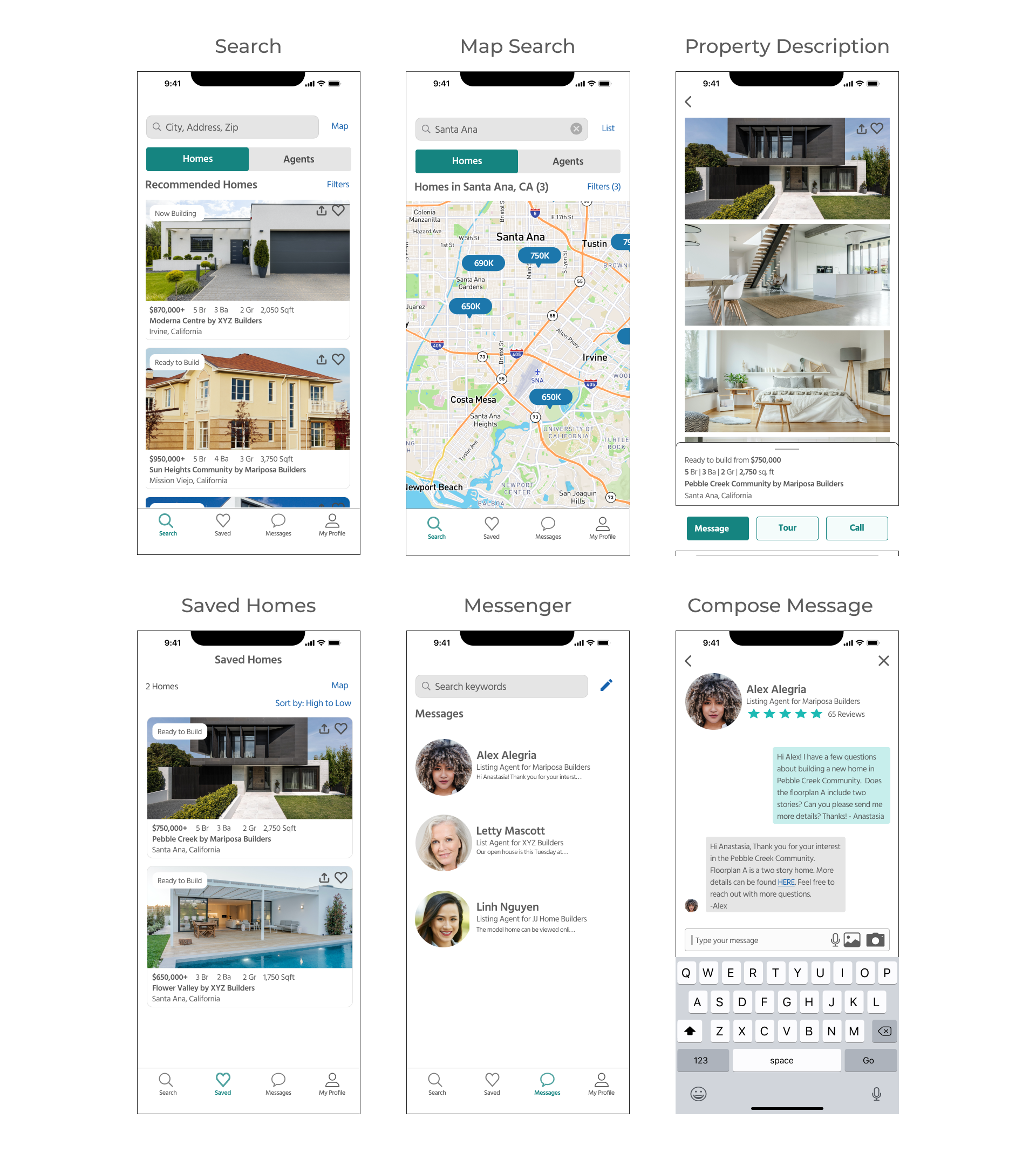
I implemented the changes based on user feedback and brought the screens to life by adding color, photos, maps, and details to the high fidelity wireframes.
Raquel and Ezekial can now use the Built app to find information on newly constructed homes across the state of California, find and directly message agents, and save their favorite homes from the convenience of their smart phones!
RETROSPECTIVE
KEY LEARNINGS
Quick iterations save time + allow for revisions after feedback
Users have a different perspective from designers. They can shed light on designs that do not align with their mental model.
When I run out of creative juice, go outside for a walk and play with my pup.
Find inspiration from my world around me :)
WHAT WOULD I DO DIFFERENTLY?
Spend less time on early iterations
Create responsive designs from the get-go
NEXT STEPS
Design My Profile section
Conduct user testing on high fidelity prototype
Run app through an accessibility checker